Feeds:
Posts
Comments

Posts Tagged ‘farrow & ball’

The Farmhouse is getting a facelift!

Yes, that adorable little (heated) house has new residents:   Barefoot Dwelling.   These girls had a vision immediately.  And what has inspired me so about this is that their vision was totally different from what mine had been.

I don’t know about you, but someone with a fabulous vision, totally outside my usual style, inspires me like little else can.  It’s what invigorates me every time I travel, and to have such a vision unfold right here in front of me is exciting!

DSC_0171

So here’s a little BEFORE & AFTER fun for you:

BEFORE, Room 1:  Let’s start in the first room, which was the kitchen.  You may recall how it looked when we first took possession of it in July 2012:

DSC_0609 DSC_0608

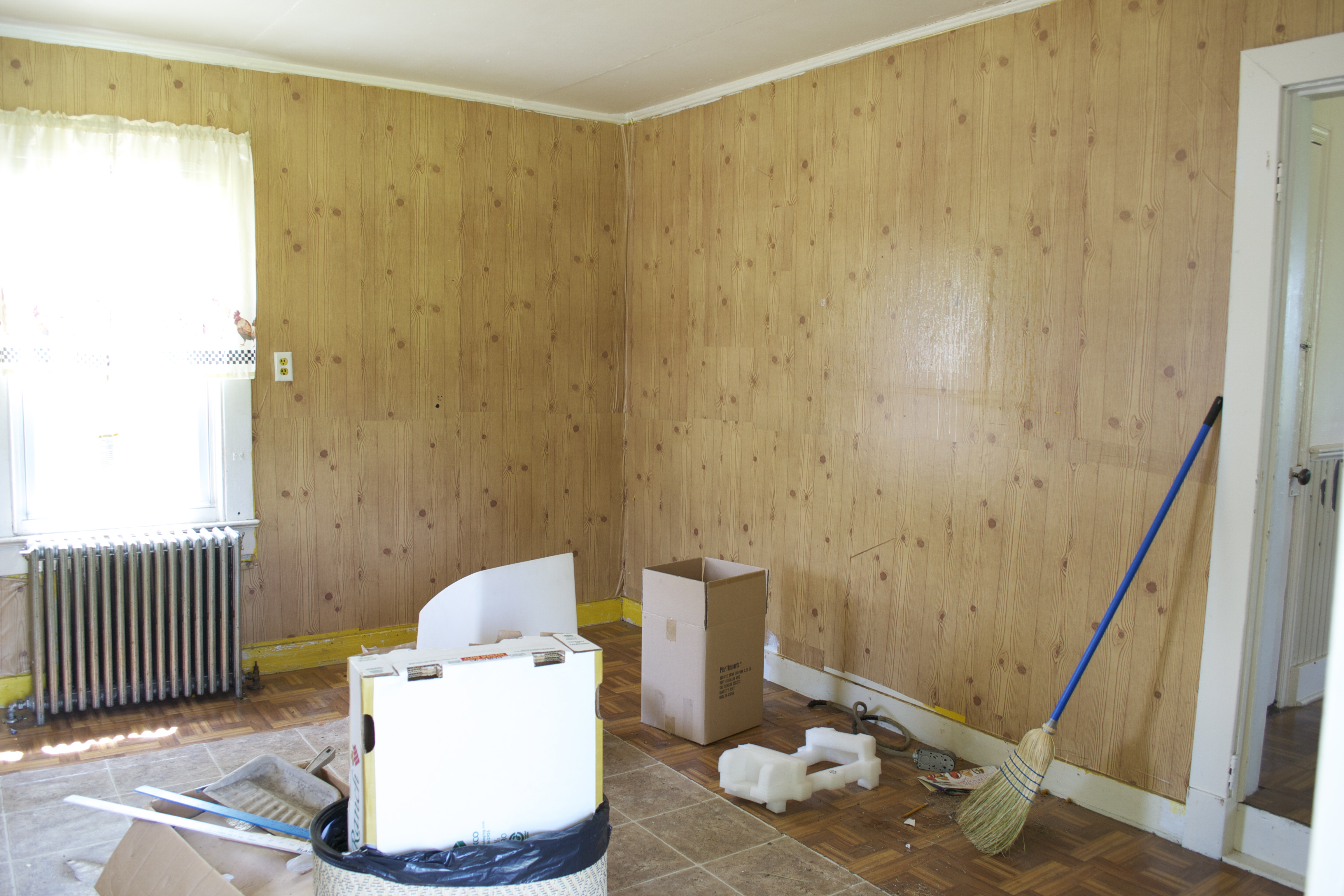
After removing the contact paper ‘wallpaper’ and vinyl ‘parquet’ floors:

DSC_0611DSC_0609

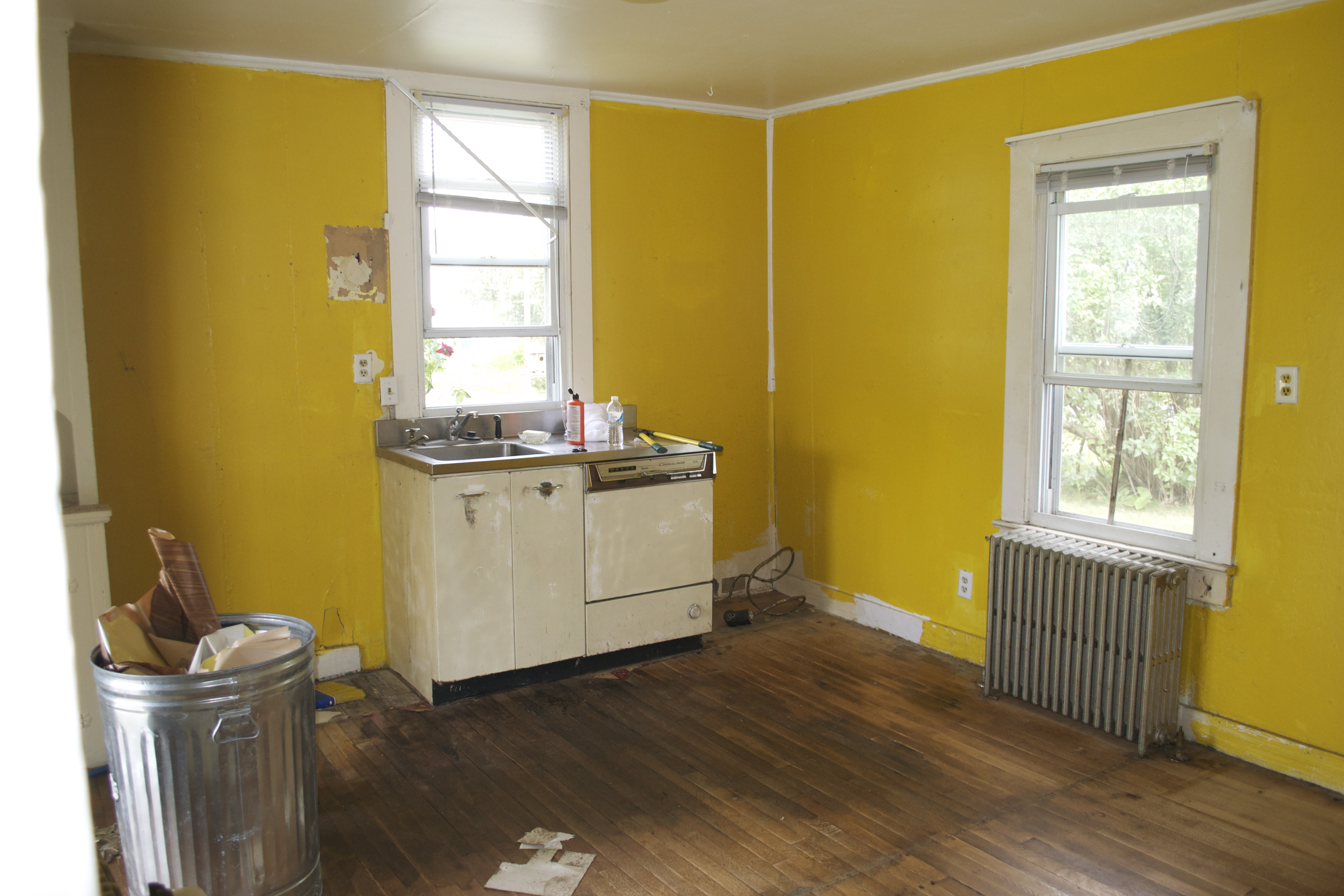
Two and a half years ago, after applying Farrow & Ball’s Pavilion Grey :

DSC_0634

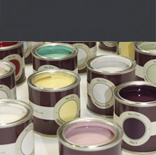
Now, with a fresh vision comes fresh color!  Using Farrow & Ball’s fabulous paint, Lisa and Mary, owners of Barefoot Dwelling, chose pure white, with contrast, feature walls.

DSC_0001DSC_0002

AFTER, Room 1:  In this first room, the color grabs you right away, it’s Farrow & Ball’s Charlotte’s Locks.  Such a great punch with the fabulous mid-century pallet they’ve collected.

DSC_0173DSC_0170

DSC_0175


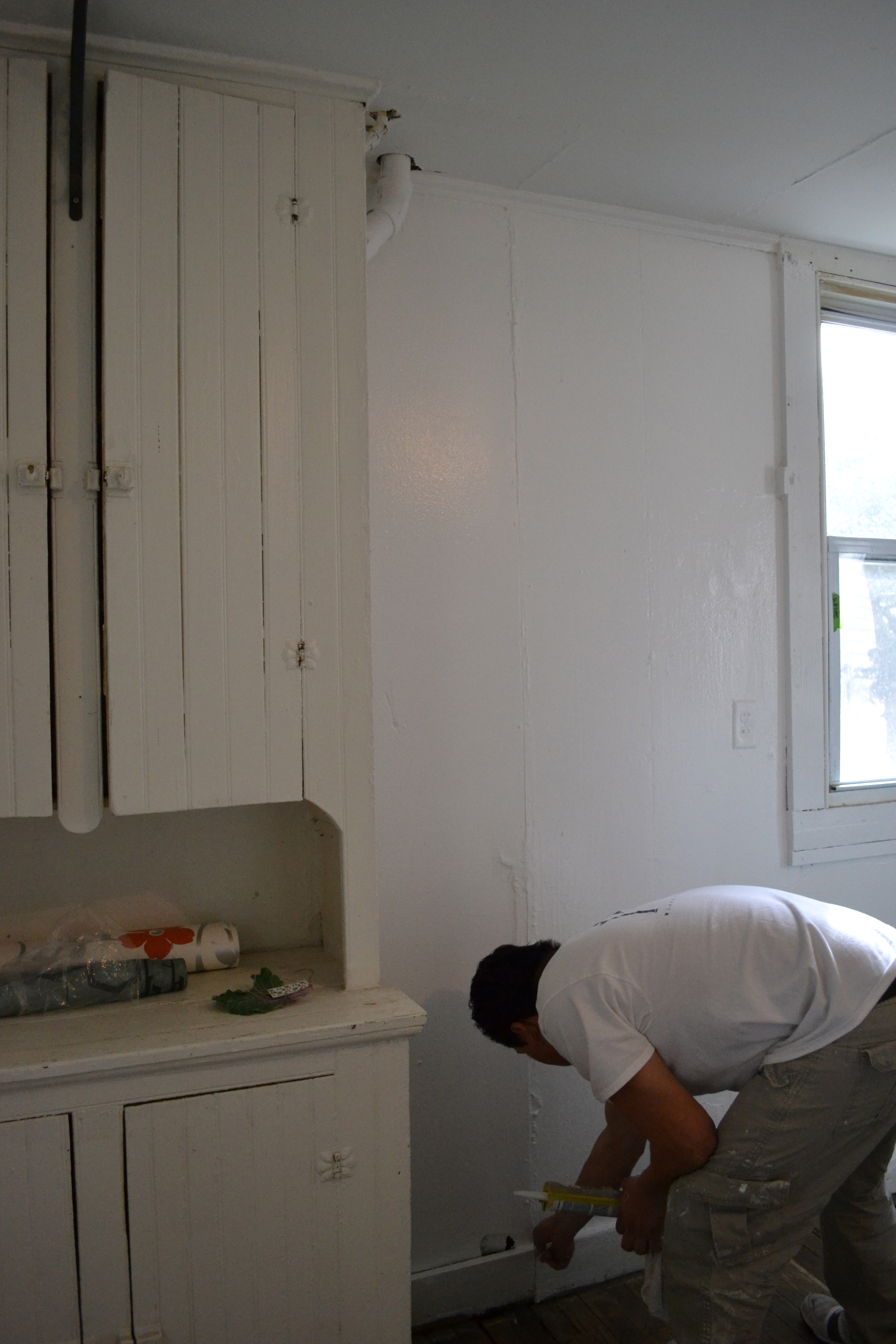
BEFORE, Room 2:  Then on to the second room, as we found it 2 1/2 years ago:

DSC_0612

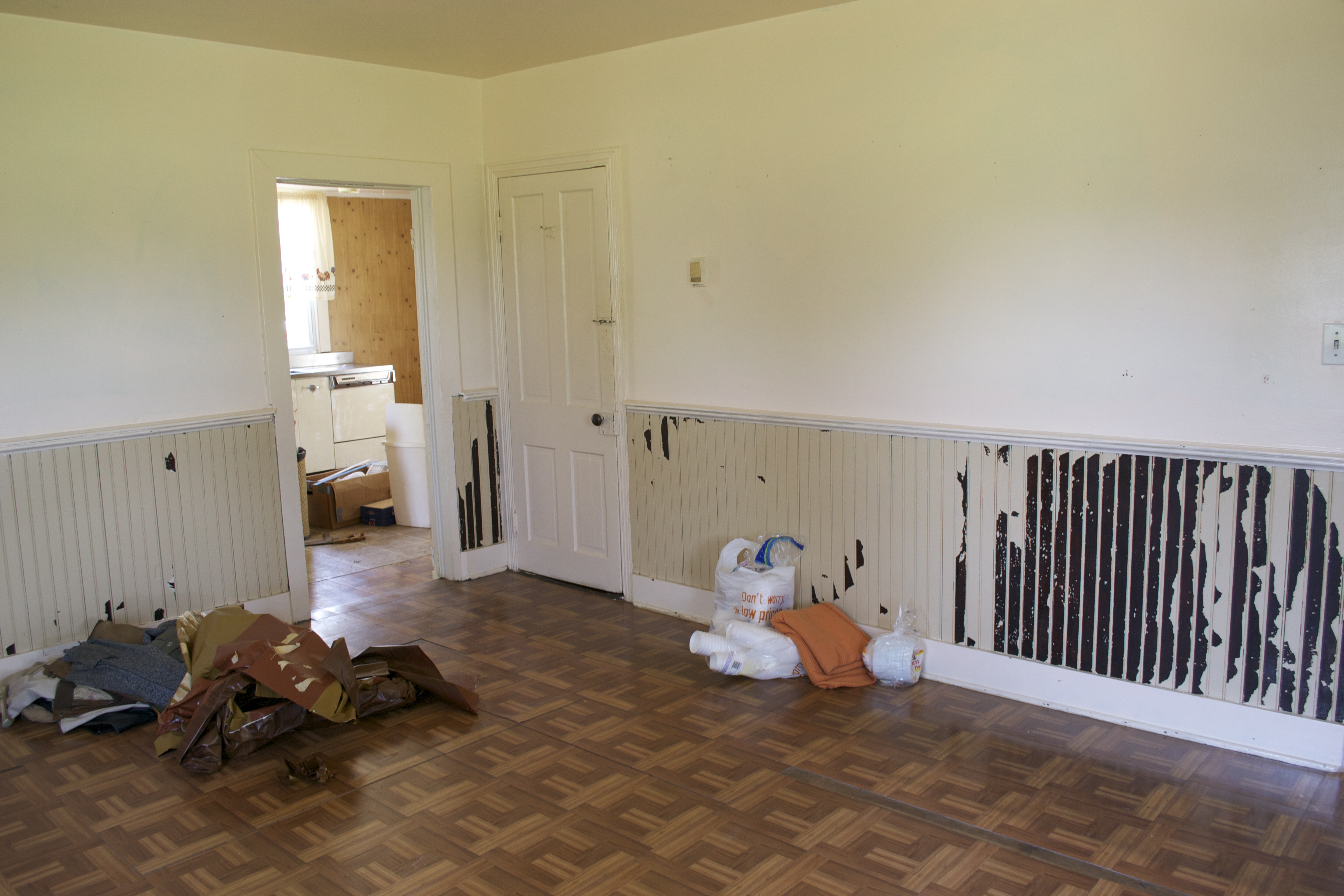
After removing the rest of the contact paper covering the wanescoating, and  more of the vinyl ‘parquet’ floor:

DSC_0614

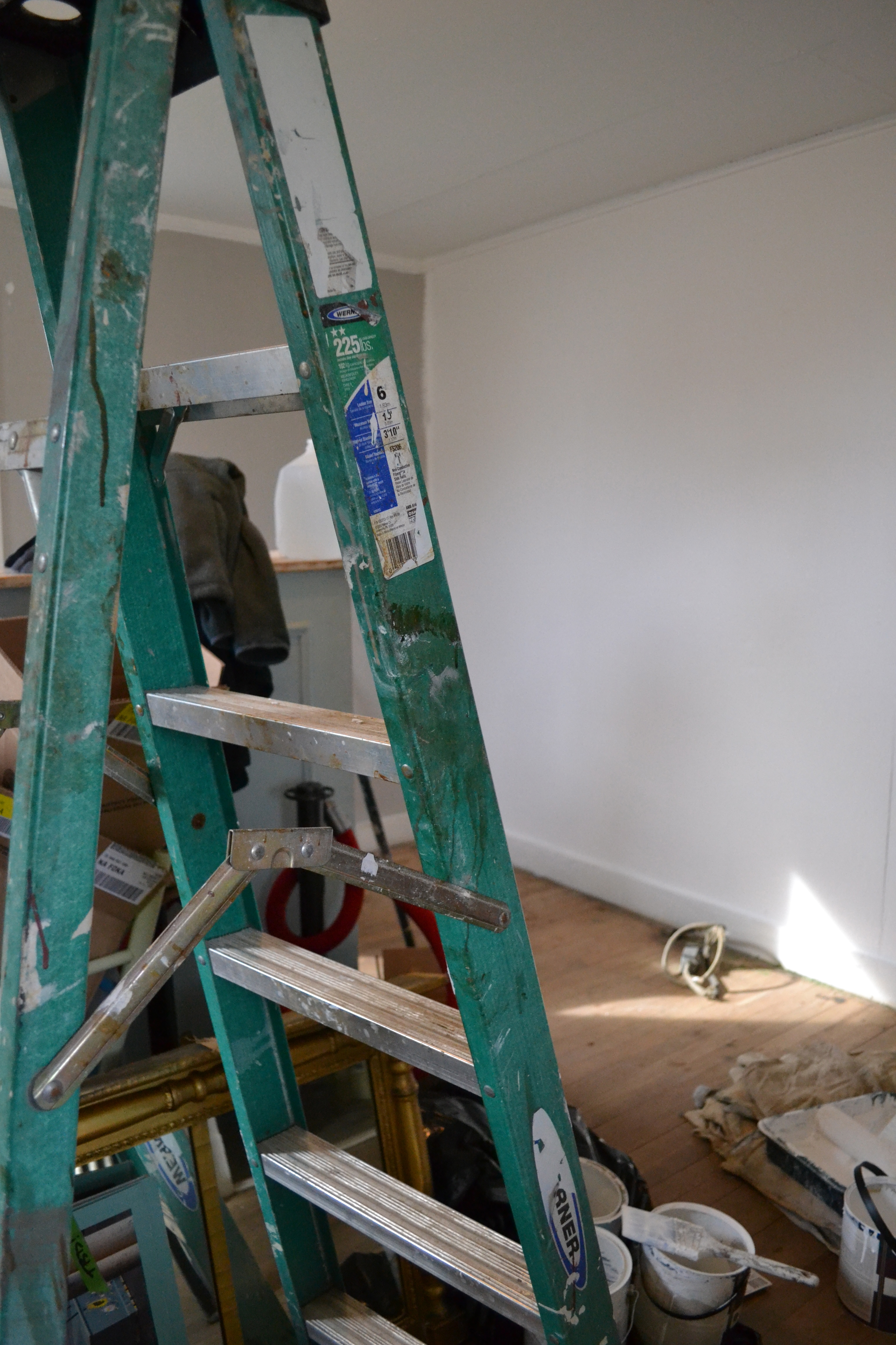
Then, after a fresh paint job (Farrow & Ball Pavilion Grey)  in 2012:

DSC_0639

AFTER, Room 2:  Now with a a fresh white facelift, complemented by a contrast wall of Farrow & Ball’s Churlish Green (yes, that’s a paint name, don’t you just love it??!!)

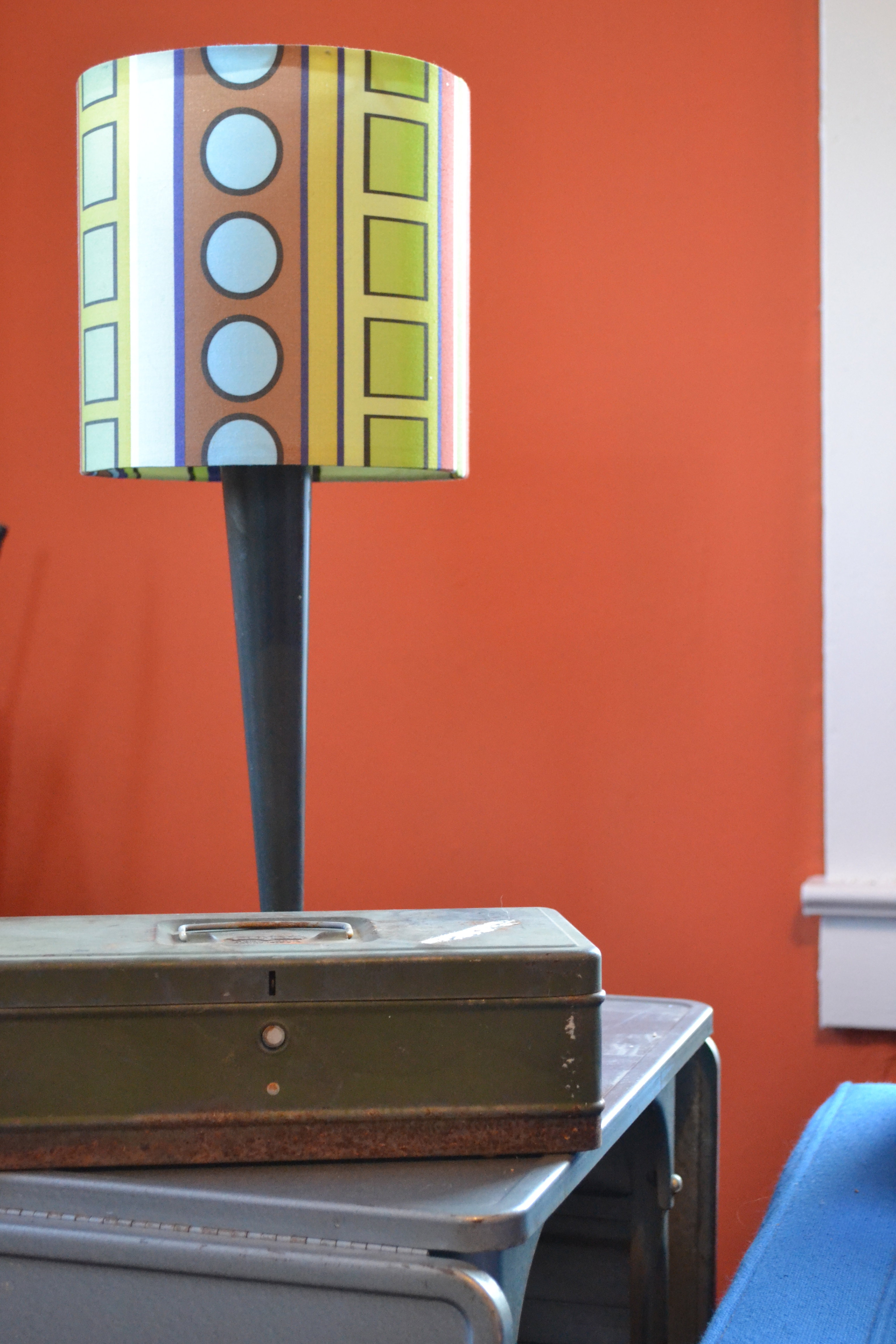
And check out the sleek mid-century aesthetic.

DSC_0163


DSC_0164

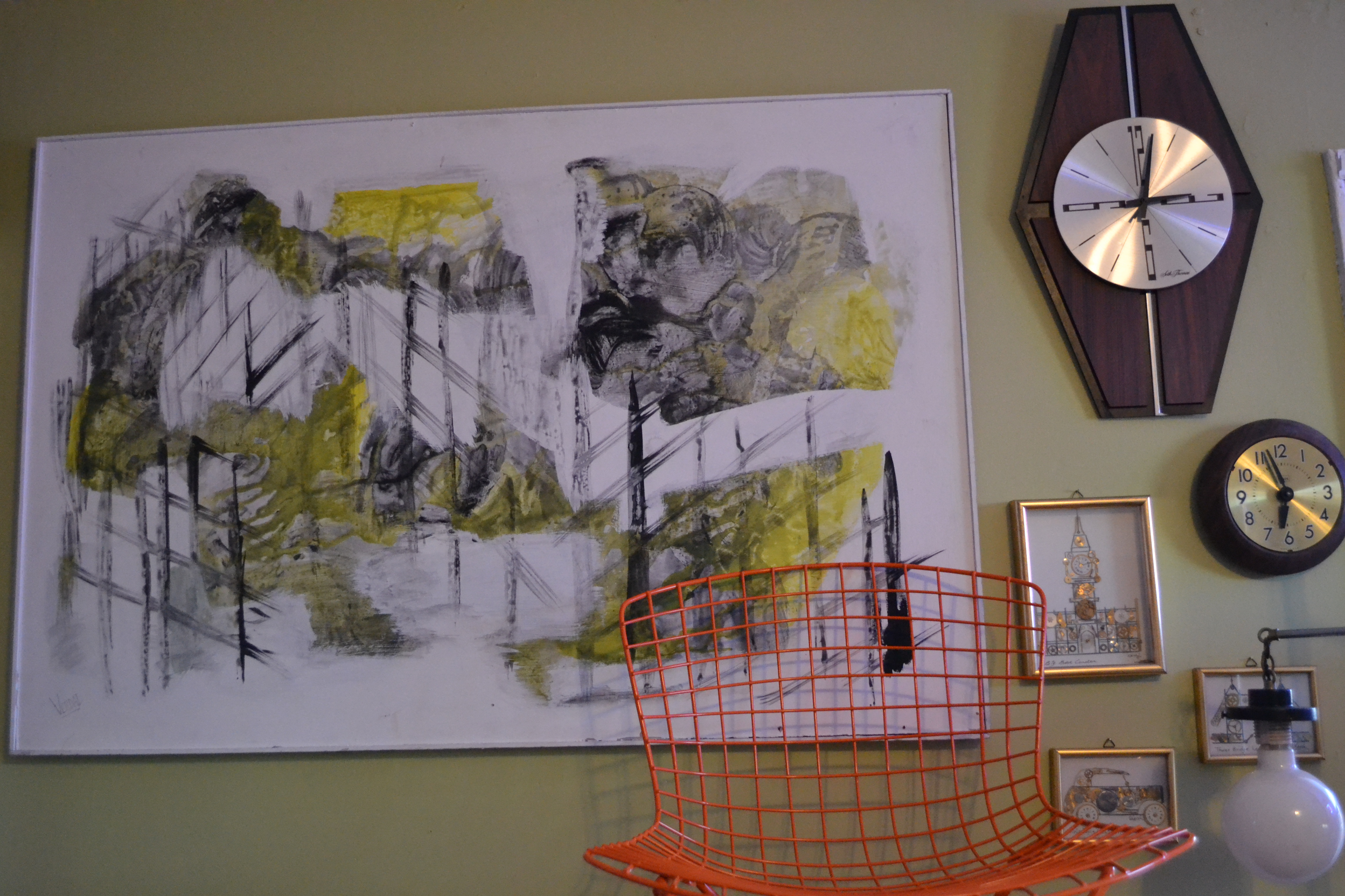
This room has NEVER been so cool!

DSC_0168

DSC_0169

More great stuff is being added through the week, and you’re all invited to come take a look this weekend, February 20-22, Fri/Sat 9am-4pm, Sun noon-4pm.  I hope you’ll find it as fresh, original, and inspiring as I do!

Thanks for reading,

Virginia

Read Full Post »

Yes, I’ve finally committed to a paint color for the Chartreuse & co barns!  The winner is:  Railings for the window and door frames, Cornforth White for the mullions – both from Farrow & Ball.

And here’s the really cool thing:  As I stood there, staring at the face of the barn, trying desperately to envision it painted grey, charcoal, anything, Rosanna (owner of Bella Villa shop in Aldie) approached me and asked what I was doing.  I explained my agony:

“See those silos and how they’ve weathered?  I love those colors and want that pallet for the barn . . . but how ?”

DSC_0356 DSC_0354

Rosanna, gifted stylist that she is, offered this suggestion:  “Why not just sand it and seal it.  Keep the weathered look you love, and just freshen the paint on the trim?”

DSC_0001

I could have kissed her!

So where you see the dark green paint now, we’ll have the Farrow & Ball Railings.  The mullions (the inside dividers of the windows) will be Farrow & Ball Cornforth White, plus, because it’s an awesome part of the barn structure, the upper barn door (partially open in this picture), as well as it’s hardware and track, will be painting the Railings, too.  All the rest will be simply power washed, lightly sanded, and sealed to preserve that beautiful, natural aged, gray and white wooden appearance.  Can’t wait to see it complete!

So we lined up the paint, the painter, and a block of sunny days.  But, of course, nothing goes as planned.  As work began we realized that all the old wood framing around the windows was completely gone.  And by gone, I mean you could push your hand into it and pull out wood pulp!  I couldn’t believe it!  But as luck would have it, Rob, who was doing the painting, is also a gifted carpenter.  He is actually recreating the window frames exactly, to match the circa 1920s pieces.  Some of the painting is complete, but the whole project will be ongoing into fall.

NEWS FLASH!!!

homepage_buy_paint

Beginning with our  August event (August 15-17), Farrow & Ball paint is available at Chartreuse & co!  Yes, that fabulous, best-in-the-world paint that I’ve been gushing over for years (Bedroom Redux, Color Happy, Before & After, Laundry Room Blues)  We’re working with Patrick Street Interiors, the local stockist for the paint.  You’ll find a seasonally edited selection of the 750ml cans (approximately a quart) to try on your furniture, or, as I have done, all over your walls!  Be forewarned:  Farrow & Ball paint spoils you for all other paints.

Thanks for reading!
Virginia


Read Full Post »

Paint can be tricky.  Add to the mix the lightening effects of painting exterior surfaces, and I become frozen with indecision.  Whatever I choose, I’m stuck with it, and so is everyone who drives by and/or visits my barns.   So here I sit, paralyzed with indecision as the warm summer painting season passing by.

A mere six years ago, when we purchased this property from my family, we had the barns painted.  Feeling nostalgic and wanting to honor the past, I simply had them repainted as they had been all my life:

IMG_3862

Classic white with dark green trim.  If you travel up and down Buckeystown Pike, you’ll find barn after barn painted this same way.

DSC_0001


But the job was done poorly, and now, after only six short years, we’re faced with the need to paint again.   And I’m itching for a change.

I’d really like to move on to this look:

barn paint

railings-trends


Farrow & Ball’s Railings is an great choice.  I attended one of F&B’s color seminars, where I learned to go 2 tones darker for exterior color, as the sun washes it out, making it appear much paler outside than it does indoors.

700_farrow-and-ball-railings-color

Here’s Railings as a trim color – so beautiful.

There is no comparison for richness and fullness of color to the Farrow & Ball paints.  And here’s another choice – but paler:  Downpipe:

downpipe

downpipe against red brick

I really like this color in combination with the red brick.  Our house (which could also use fresh paint) is red brick, and I’d like consistency throughout the property.

Farrow & Ball downpipe

This image above is F&B’s Downpipe against Cotswolds stone.  But doesn’t anything look beautiful against Cotswolds stone?


Amherst grey

And then there’s Benjamin Moore’s Amherst Grey.  So elegantly sharp with it’s crisp white trim.

amherst grey benjamin moore


Or, Benjamin Moore’s Kendall Charcoal.  This image gives you a great look at how color can change.  On the cards, Kendall Charcoal is darker than Amherst Grey, yet if you compare these images, they appear to be almost the same color.


Best Exterior Outdoor Green House Paint Color, Benjamin Moore Black Forest Green, Gardenista

And here is Benjamin Moore’s Black Forest Green.  Try to envision this barn with crisp white trim framing the small door, and outlining the detailing on the large barn door.

You see how it goes?  I just need to choose and get on with it.  But whatever I choose, it necessarily eliminates all those other beautiful, tempting choices.

It’s just so hard to decide . . .

I’d love to hear your thoughts on this vexing issue!

Thanks for reading,

Virginia

Read Full Post »