Feeds:
Posts
Comments

Archive for August, 2012

Believe it or not, I’ve never actually used chalk paint before yesterday.  I see the beautiful pieces come into the barn.  I see them online.  I really love the look and so many of the colors.  But I’ve been reluctant.  Partly because I’ve heard there’s a learning curve involved, and partly because it’s not easy to get.

So I’ve never tried it.

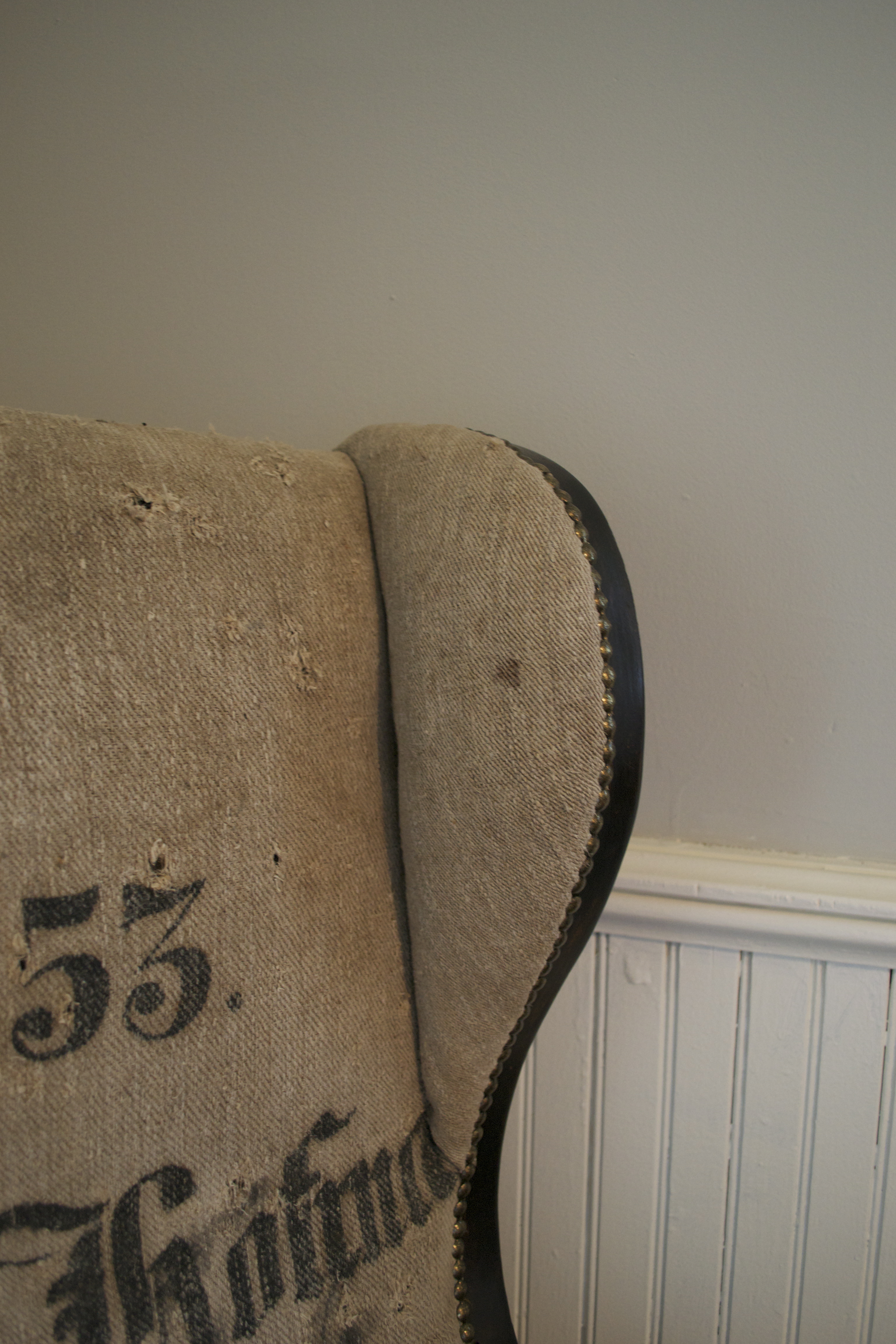
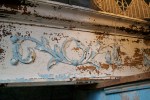
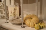
Until yesterday.  As I was looking at this piece:

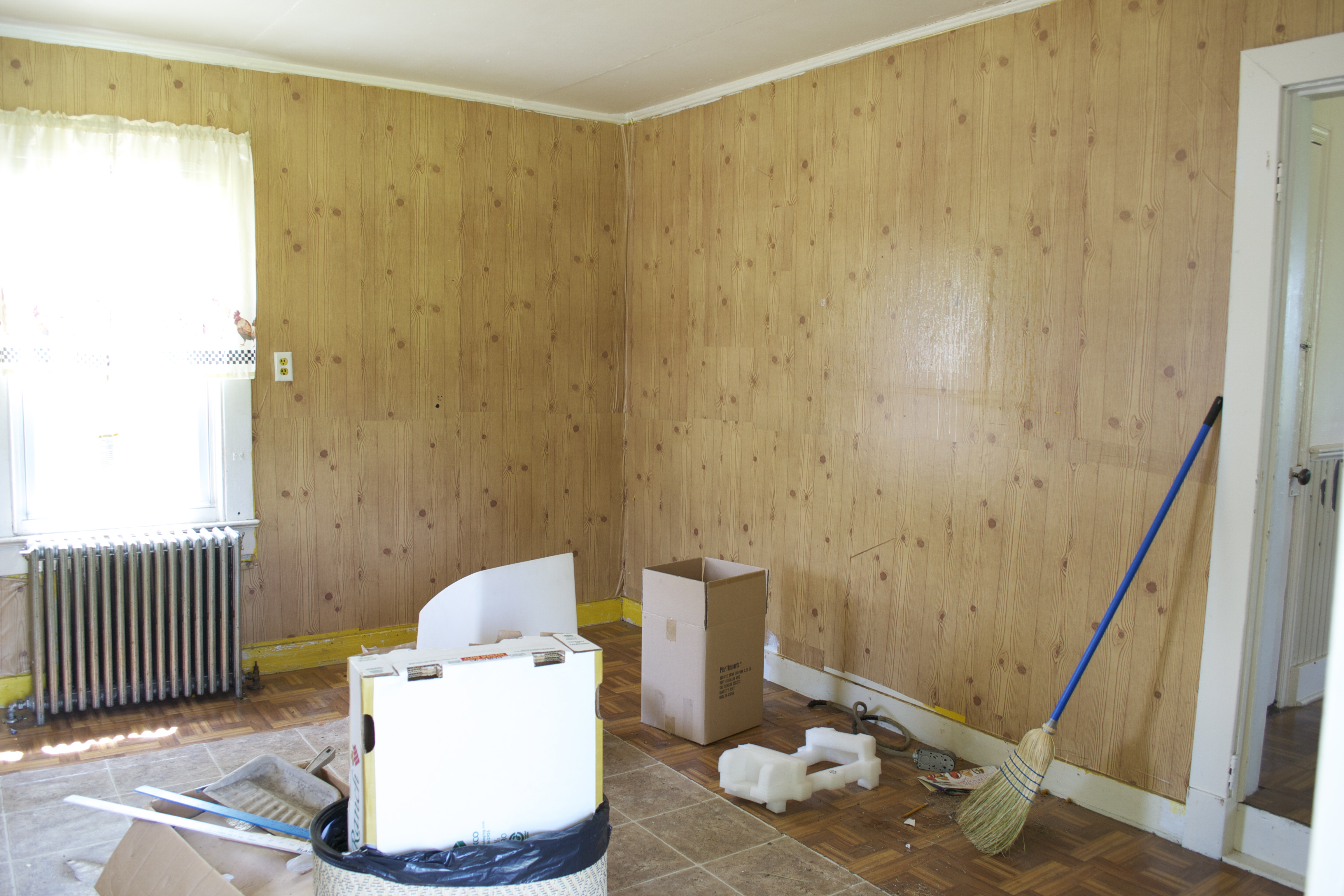
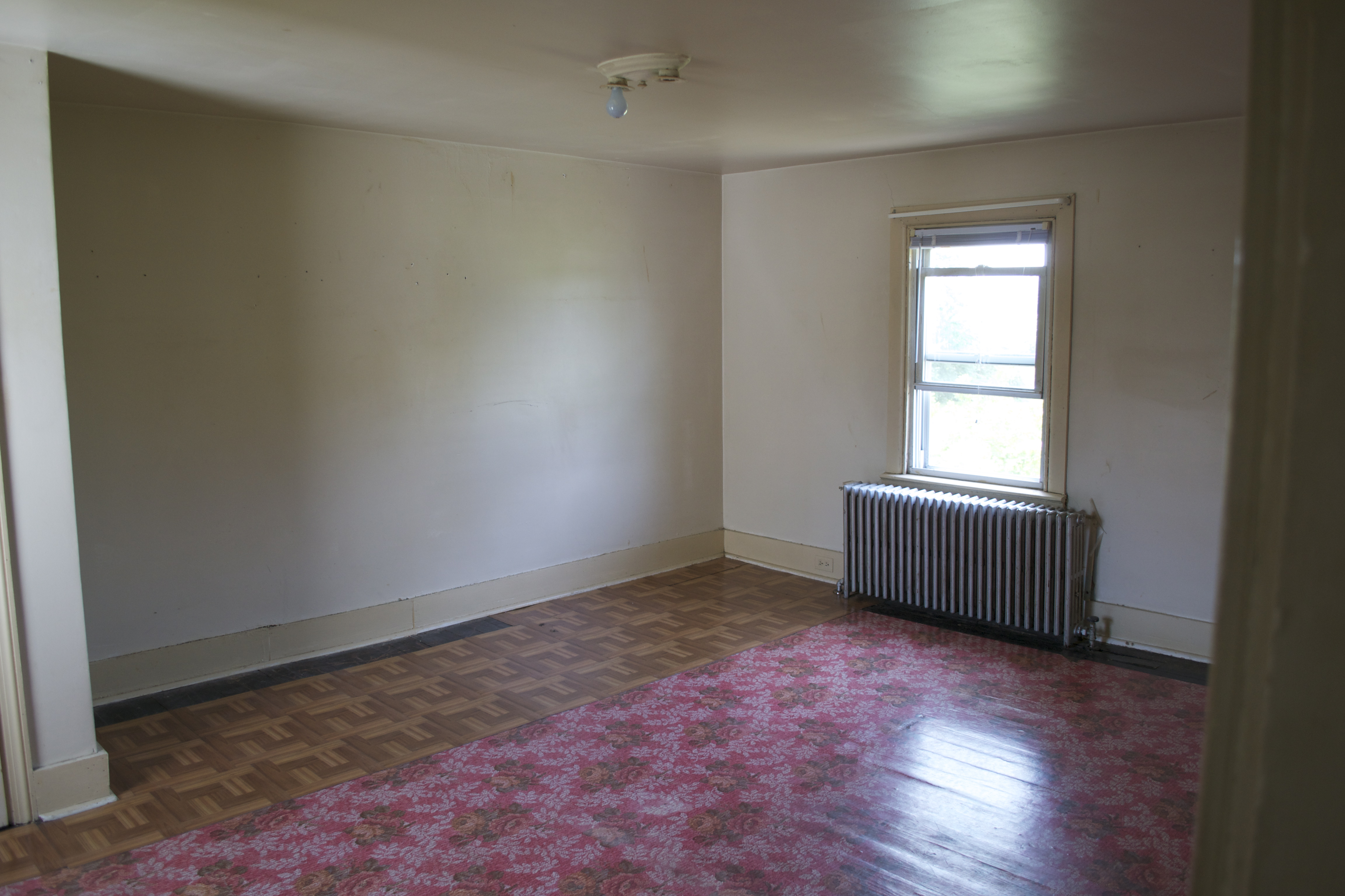
It’s got such great lines, outstanding construction (it’s actually a solid oak Thomasville piece) but the yellowish, 70’s stain, with slate blue highlights,  just weren’t working for me.   Painting it was the obvious solution.

Some crazy thought flicked into my head that this piece, and this time (3 days before Market Days)  was right for trying chalk paint.

Common sense tells you to try a new technique on something small and unimportant.  Take a good look at this hutch.   It’s so tall that I need a step ladder to reach the top.  It’s about 6′ wide, and weighs more that a small elephant.  And I was planning it for the centerpiece of my Market Days display.  This piece is both huge and important.

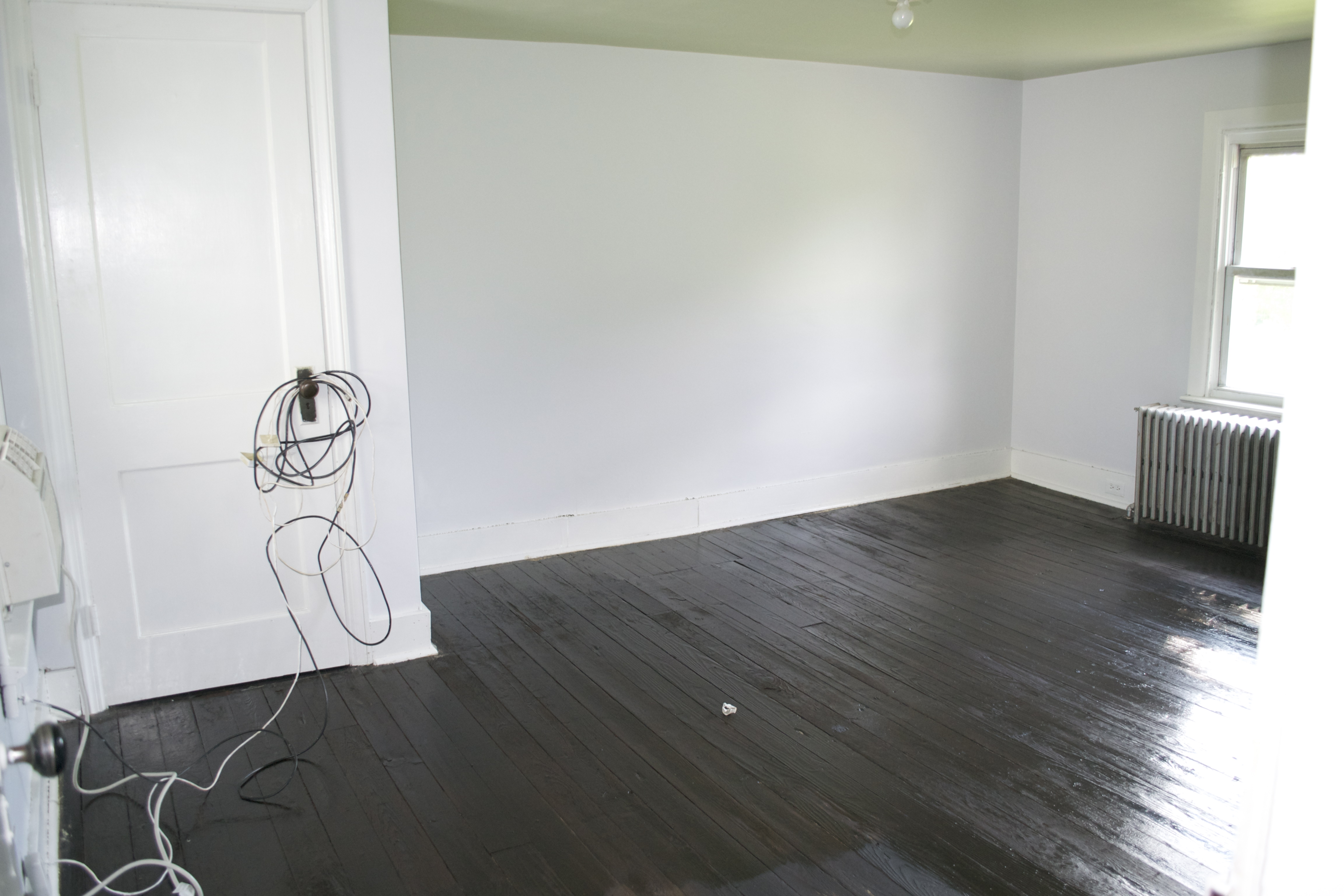
Undaunted, I started in with my deep taupy paint.  Just the muted cocoa/grey shade I was looking for.  It was looking great, and going on so easily!  “Wow, looks like it really will cover in one coat!”  I wanted to squeeze myself.  You see a big part of the motivation to try chalk paint was that so many people had told me that this miracle is true:  chalk paint covers in one coat.  And it doesn’t chip, or need primer.

But when I climbed down off of my ladder and gazed back up at my masterpiece, I saw that the paint was drying at least 6 shade lighter than it went on!  It was almost cream colored!  Oh no.

I took a deep breath.  That’s okay.  I’d planned on the antiquing wax.  It’ll make all the difference.

Out comes the wax.  Now I’ve waxed before.  And I know that wax takes elbow grease.  So elbow grease I gave it.   Initially it was beautiful.  The happier I was with it, the more intensely I rubbed it in.  Until – oh horror! – the wax was pulling the paint off.  Throughout the piece I was looking at whole swathes that were just antiquing over the original finish.

I could have cried.

Instead I walked away.   In search of someone to whine to.  I found Fran.  Fran is a seasoned painter, and a master fixer-upper.  “Oh just dry brush some more paint in those spots.  It’ll look great.”  I wanted to believe her.  I wanted to have it all turn out.

My plan?  Abandon it.  Have a limoncello martini (an excellent solution to most summertime problems), a good nights sleep, and paint it with some Farrow & Ball in the morning.

But when I returned this morning, I decided to try Fran’s advice after all.  And look at how it came out:

I am so pleased with the finished product!  I really  love it.  And it did actually cover in one coat.

Turns out my problem was that I should have wiped the wax on gently, not so harshly.   Upon further investigation (and whining to everyone who would listen to me AND knows something about painting with chalk paint) the Annie Sloane paint has quick drying qualities that the paint I used does not.  Additionally, the Annie Sloane wax does not rub off the paint the way the wax I used does.  On the flip side, this wax is completely organic and natural and doesn’t smell at all.  The Annie Sloane wax (though much easier to work with) does reek.  So there’s the trade off.

What do you think?  Do you like the final effect?   You’ll have to wait to see the whole thing, as it’s so heavy, that I have to have 2 men to lift the top back on.

By Saturday morning it’ll be fully decorated, and you’ll see it if you drop in on Market Days.

Another Market Days perk?  Repurposed & Refined, one of the temporary dealers, is offering chalk paint demonstrations throughout the day.  I think I’ll be taking one in!

Thanks for reading,

Virginia


August 12, 2014:  Here’s a few places to go if you’re interested in learning more, from real experts, on chalk paint and specialty furniture painting:

CeCe Caldwell Chalk Paint (http://cececaldwells.com/instructions-for-use/)
Annie Sloane Chalk Paint (http://www.anniesloan.com/)

And now my favorite paint company in the world, Farrow & Ball, has jumped into the game with some great insights into painting furniture with their extraordinary paint:

http://us.farrow-ball.com/find-it-paint-it-love-it/content/fcp-content

Have fun!!

Read Full Post »

I was just in the Garden House today, and look what I found!

Doesn’t the painted furniture look amazing against the rough floors.  Rosanna of Bella Villa came in and magically transformed the one-time kitchen with her tiffany blue accents and pretty pieces.
Here’s some more of what I found, and you can see this weekend, along with the all the Market Days dealers and our full barns.


Lothar of German Favorite Antiques has also been working his magic, and here are some of the results:


Thanks for reading,

Virginia


Read Full Post »

Between Tag Sales and renovating the cottage (a.k.a. The Garden House), we’re also putting on our fall Market Days this weekend. It’s a blast – dozens of temporary dealers arrive, put up their tents, bring out their fabulous finds – it’s like Christmas for me!  I mean, think about it – all this coming to your backyard.  You have to admit it’s pretty awesome.

I just loved how everyone embraced the grounds so creatively!

But, as I await the arrival of all these cool dealers, I (and the rest of the Chartreuse & co gang of permanent dealers) have to get the barn ready and picture perfect.

In going through the barn, I realize this time, many of my favorite things are objects I’ve seen many times before, but now see them used in a creative way.

Here’s some of my favorites today:

Love these glamorous chairs.  The textured, graphic fabric is spot on.

So amazing to find this hip, mid-century modern lamp with it’s original shade.  It’s a single object update for any room.

TThe carved details on this table got it on my list of favorites.

Mid-century modern pair – freshly reupholstered in a great basket-weave fabric.

Yup, it’s the birds on these bamboo rugs that got me.

I’m a sucker for channel-back chairs.  This one is spectacular in it’s new fabric.

Love these vintage accessories.  Turning a garden urn into a pencil cup is such a great idea.

The silver rims of this glassware set makes them so versatile and ready for the coming party season.

I just love vintage suitcases, and this little stack is just right.  The train case on top seals it for me.

What a cool, funky cupboard!!!  The window detail at the top, the corrugated metal back, the primitive details throughout – all these make this one a favorite.

I’ve seen vintage bowling pins as sculpture, or funky graphic detail, but I just loved seeing them as bookends.

This pine cupboard is just so cute with the vintage crates inside to organize all the goodies to be stored.

Red is looking so fresh to me right now.  Is it the season change?  The contrast with the neutrals I see so much of?  I’m really not sure.  But this piece is a knock out.

This pair of wing-backs is just so pretty.  The tone-on-tone, textured fabric in such gracious color sets them apart.

Love these bottles.  The deep green color, especially.  And I just love them lined up, popping out of the urns like little plants.  Just plain fun.

These funky little owls are just so cute!  The pale blue color, and their feisty expressions make me love them.

Another clever repurposing that I just love:  using bicycle baskets as file holders.  Adorable.  I also love using the hooks to hold a pretty pencil holder in a handy spot.

I really like the french provincial lines of this china closet/bookcase.  But paired with this swanky chair updates it and makes the ensemble a stand out to me.

And what is the fall without wine tastings, wine festivals, that oh-so-important glass after the homework’s done and the kids are in bed . . .

Possibly the coolest repurpose I’ve seen:  carburetor covers turned sconces.

So there you have it – my favorites today.  Tomorrow I’ll probably have more.  And I’ll be updating on our barn website, chartreuseandco.com

One more cool thing coming up this weekend:  we’ll have two of the rooms in the Garden House open!  If you’re in the area, drop in and see it.

Thanks for reading,

Virginia

Read Full Post »

Actually, this should be titled, “Before & Now”, because while it’s technically ‘after’ pictures I have, they are not the magazine-ready kinda after pictures you may be hoping for.  Things happen around here in baby steps – mainly because we inevitably run into the unexpected.

So this post is really an update on the ‘cottage’ we’re working on.  And I can hardly express how happy I am to just be this far along in our process.

ROOM #1:

BEFORE

You may recall that all that wood is actually contact paper.  And those parquet floors are stick-on vinyl tiles.

ImageSo here’s what we had after removing the contact paper and vinyl tiles.  Yes, those are holes in the wall. But the hardwood floors had a great patina.Image

AFTER:

This is what we have today.  A bit of patching, a couple gallons of Farrow & Ball’s Pavilion Gray, trimmed with Benjamin Moore’s White Dove, and it’s worlds better.  Don’t you think? It makes me so happy to open the door now!ImageI just LOVE the old built-in cupboard!

ImageHere’s a detail of the colors.  So pretty and calming.Image


ROOM #2:

BEFORE

This room seemed to have the most potential because the lighting is so nice and the wainscoting has so much charm.  But this room had the stickiest floor tiles of all.  We tried everything, and finally ended up using a belt sander to sand the gunk off the floors. Image


AFTER

We had initially planned on staining the floors after sanding, but I really like the look of the raw sanding.  The patina would be totally lost when covered by stain.  What do you think?ImageRoom #2 BEFORE

(with the ‘parquet’ floor)ImageParquet floor removedImage

AFTER

And, voila!  The wainscoting did not disappoint.  Nor did the soft natural lighting of the room.  ImageDetail of the wall color in Room #2ImageIt’s the same Farrow & Ball Pavilion Gray that’s in the first room, yet look how the lighting changes it.  I just LOVE that about the F&B paints.ImageRoom #3

BEFORE

Again with the floors.  And this wall color was almost like a trip to the Caribbean.  It was super intense.ImageThe ‘parquet’ floors removed.ImageAFTER
We’re still working on this one, but the walls are finished, painted Farrow & Ball’s Blue Gray, with F&B’s Old White as the trim.  The combo is like a softer, warmer version of the colors in the other two rooms.  A really comforting transition.ImageDetail of the wall and trim colors.

Image
Room #4

BEFORE

Moving upstairs, this room is directly above Room #2 with the wainscoting, so it has that beautiful natural light.  Even though it’s the smallest room in the house, it’s one of the prettiest.

Image

AFTER

And here’s what paint can do.  Farrow & Ball’s Borrowed Light, trimmed with Benjamin Moore’s White Dove.  Upstairs we did stain the floors, using Rustoleum’s Kona stain.  Don’t you just love the deep, rich floors in contrast to the pale walls and trim?ImageBEFORE (Room #4)Image


AFTER (Room #4)

Another angle of this beautiful room.  You just want to stay in there it’s so pretty.

Image

ROOM #5

BEFORE

This is the room above the turquoise room.  It had the grungiest walls and trim of any room in the house.  It took 2 coats of primer to make them paintable.  And, like every room in the house, it had the vinyl tiles on the floor.Image


AFTER

And here it is with F&B’s Blackened on the walls and Cooking Apple Green on the ceiling, and Benjamin Moore’s White Dove trim.  We used the Rustoleum Kona stain throughout the upstairs.ImageAnother view with more of the ceiling showing.Image

So there you are.  We’re about to finish up completely with the renovating process and begin the decorating – my favorite part, of course.  I’ll keep you posted!

Thanks for reading,

Virginia

Read Full Post »

I get asked about sources for affordable, high-end fabric all the time, and thought you might like to get the scoop.  My favorites are right here in the DC/MD/VA area.  They are:

1.  Haute Fabrics in Marshall, Virginia

This is a selection of not just decorator fabrics, but truly high-end designer fabrics.  Bolts that would be over $100/yard can be found for less than half that.  And in some cases 1/4 or less of retail.

2.  Discount Fabrics in Thurmont, Maryland

A warehouse full of fabrics, notions, and fillers for pillows.  Leather, linen, silk – they’re all here, and discounted.  My favorite section is their $5/yard ends-of-bolts section.  You can get up to 7 yds on a bolt this way – enough to do a chair.

3.  G-Street Fabrics in Rockville, Maryland, and Chantilly and Falls Church in Virginia

This store used to be phenomenal, with an entire floor dedicated to designer decorator fabrics.  Again, my favorite section was their end-of-the-bolt area – just piles of fabrics to dig through!  However, with their move a number of years ago off Rockville Pike, it’s just not the same.  (I haven’t been to their Virginia locations; they may be more like the Rockville one used to be.) Hence they get #3 listing here.

And if you’re looking for super-cheap in quantity, I was just scanning Pinterest (okay, so it may have become an addiction), and found a link to Momtastic blog, featuring sources of decorator fabric for under $10.

If you search these with “$10 and under” plus the color you’re looking for, you’ll find a nice selection at super affordable prices.

Here they are:

1. 800Fabrics.com
2. Carousel Designs
3. Fabric.com
4. HawthorneThreads.com

Happy decorating!

Thanks for reading,

Virginia

Read Full Post »

I don’t wear a lot of jewelry. But I love a single, beautiful piece. With fall and winter coming, I begin to think about that just-right piece to finish off my outfit. If you get the right piece, your clothes can be of the simplest form and design, yet your look will be polished and put together.

My favorite designer of such pieces is Fran Simons of & Coco. Here’s a few pieces that she brought into the barn this weekend.

I have a soft spot for cameos. For my 21st birthday (and graduation from college) my grandmother Thomas (for whom I am named) gave me her grandmother’s cameo engagement ring. I gave it to Katherine, my older daughter, when she graduated from my alma mater, Hollins College.
Chip, knowing my weakness for these delicate pieces of wearable art, has given me several over the years, and I love them all. This piece of Fran’s updates the cameo into a chunky necklace, without losing the cameo’s star quality.


Each element of this necklace is is playful and fun. The coin/chip/button – I really don’t know which – shines with that pop of red. The elements all play so nicely together.


Okay, so now we’re into the bling. I think this one’s centerpiece began life as a shoe clip. Can you imagine clipping a pair of rhinestone encrusted clips of this size onto your shoes? I really don’t think I could walk in them. But this necklace? Perfect.


The simplicity of this numbered tag is charming. I don’t even like the number 17 – not sure why, I just don’t – but I really like this necklace.


Imagine this deeply plunging pearl necklace finishing a simple, mono-chromatic dress. Lovely.


These cuffs create glam with the simplest of outfits. Think jeans and T-shirt or turtleneck. One of these finishes it off just right.


If you’ve ever had a rosary, you’ll recognize the origin of the pieces of this bracelet. It’s delicate beauty is accentuated by the lovely Madonna image.


I really think I need this one. Another bracelet created from pieces of old rosaries. I love that the rosary pieces are finding a new life. A simple, yet meaningful piece like this makes me happy every time I see it.


Uber-bling! Nobody’ll miss your entrance with one of these spectacular cuffs on your arm! Love it.


These leather cuffs are enhanced with vintage brass faceplates – you know, the beautiful old backs to drawer pulls. Fran has found a delightful way to use them and really show off how pretty they are.

Have you picked out your favorite yet?  It’s hard, I know.

Thanks for reading,

Virginia

Read Full Post »

It’s been a busy month so far. House guests, renovating the cottage, Chip’s birthday (yes, it was Thursday, the big party is planned for later in the fall – when it’s cooler. ), and the sale this weekend. Here’s a few images of some favorite items from this month’s sale.

Click on any image to see it larger.  Enjoy.

And, thanks for reading.


Read Full Post »

It’s a annual ritual I’ve been through for the past 18 years, with varying degrees of enthusiasm.

It always begins with the excitement of (my absolute favorite part of school) picking out the new school supplies. There is just something about those freshly sharpened pencils, brand-new pens, gloriously clean pads of paper. I’m happy just touching and gazing at it all.

And I have spread this little bit of wonder to my girls. We’re like kids in a candy shop when all the store roll out their aisles of supplies. Each girl would pick out her favorite things. We’d come home with bags brim-full. Gaze at them, love them. . . But then, what do you DO with all that stuff?

Here’s a few ideas:

I love these old card catalogs with all their cubbies. I especially love that they can be labelled so nicely. Put each family-member’s name on a column of drawers. Label the extra drawers with the supply it holds. For larger items (spirals, notebook paper, workbooks, etc.) place baskets beneath or on top. Organization of school supplies: done!

Another great card catalog.

Brass plate detail of card catalog. I just love brass tags, and find them even cooler when they’re still attached to the object they came with.

For textbooks and workbooks, consider an open hutch. This one is great because it has the ‘bar’ across to catch things before they fall.

An industrial shelf like this one (love the wheels and side bars!) works great as a compact school organizer. Give each child a shelf. Let them pick out a basket (or get a group that are identical to save on stress) to place on his or her shelf. Let each choose a heavy, flat-bottomed object to use as a book end. Fill the baskets with their small supplies. Stack the workbooks, and secure the textbooks with the bookends. Voila! you have all their school stuff in a personalized space that takes up less than 10 sq. ft.! Pretty sweet, huh?

Lockers are another great solution. They not only catch the school supplies, but they also give you plenty of room for sneakers, hats, gloves, and sports equipment. I love the cheerful color of this set, and that the doors flip up to open. Who wouldn’t have fun putting stuff away in this cool locker set?

This locker set is made up of shelving and a set of tough locker baskets. Each basket can be completely removed from the shelf, making it easy for everyone to access their baskets at once.

Next, we’re on to desks and some really clever ways to contain your desk-top supplies.
Thanks for reading,

Virginia


Read Full Post »

The last time I saw Paris, it was timelessly itself, very much like the first time I saw Paris over 20 years ago. But this consistency should not be mistaken for lifelessness. Paris, for me, has maintained its freshness, its beauty, and, yes I must say it, its chic in a way only Paris can.

And what made it extra special this time, was that I was seeing it all with my daughter, on her first visit.  Seeing it through her eyes helped me to see it in a fresh way.  It’s the details that shine.  The desire to make every thing they create beautiful sets the Parisians apart.

Here are some images of our visit:

An apartment building on the Isle de St. Louis, the smaller of the two islands in the Seine


I found myself fascinated by the variety, details, and beauty of the doors of Paris.


Katherine’s first real look at Paris, as we emerged from the Metro into the Tuilleries Gardens (the Louvre is in the background.).


The well-known face of Notre Dame cathedral. But this is not my favorite view of it.


The spectacular flying buttresses of Notre Dame, photographed in the delightfully quiet garden behind the cathedral. One of my favorite spots in the whole city.

If you go, look for the side streets and don’t forget to look up. Some of the most charming parts of the city are the quietly elegant quarters where tourists fear to tread. Also – don’t miss the fabulous ice cream shop on the Isle de St. Louis. It’s swoon-worthy.

Thanks for reading,
Virginia

Read Full Post »